WHO WAS THE AUDIENCE FOR YOUR MEDIA PRODUCT?
As a group we have decided that our priminary target audience will consist of mostly a younger age group, the teens, just like our selves, ages 15 and over.
As a group we indentified that the genre of our film, Comedy Horror, has been very sucessful with this age group. zombieland /and Shaun /of The Dead are great evidence for this. therefore if our film was to be distributed it would be given a rating of 15. this would mean that our film will be easily accessible by our target demographic.
Nick Redfern stated that:
"Male audience members exhibit stronger preferences for science fiction, action/adventure and horror films while women preferred romantic comedies and family films."
" Younger respondents were likly to select comedy horror as thier favourite genres, whereas older audience members were more likely to selct dramas, documentaries and classic films."
This statement supports our first judgement. and after this statement, as a group we decided that our main target audience is young males but also not neglecting females as we didnt want to limit ourseleves.
HOW DID YOU ATTRACT/ADDRESS YOUR AUDIENCE?
Having such a young target audience, as a group we have made a concious decision of making a comedy zombie film, as our research showed that oyur target demographic responds to this genre positively.
We have also chosen actors which are similar in age group to our target demographic in order to attract them and mentain thier intrest in the film as we felt that having certain similarities with our audience such as age will make them respond and relate to our film more positively.
In order to attract our target audience, we used various questionares, which was given to our target audience. In this questionarre they could state thier opinions on certain factors contributing to the final outcome of our various media products such as Fonts and illustration designs.The questionarres contributted greatly in creating a great final outcome in our media poieces includiong our Production Logo and our film.
Inaddition we have also used play on words as well as humour in various media products such as our film and our production logo in order to attract our audience as we knew that our target audience responds to humour positively. we felt that this would contribute to a more rememmorable and exciting final product which will positively make an impact on our target audience.
Tuesday 20 March 2012
Sunday 11 March 2012
On March 11th wew re-filmed our film opening, altough later than planned.
Due to our limited time schedule, we strted filming early in the morning at about 11 O'clock. we decided to start early to have a consistant lighting throughout ourfilm. as we didnt want to start at for example 4 and we over run till the night. also, starting early meant that we would be able to have longer to film, meaning that we we were not as limited timewise. it also meant that we would be abkle to edit the film after the shooting.
As a group we underestimated the how long it would take to edit the film opening. in total it took appeoximately 9 hours, starting on the day of the filming and finishing early aftertoon the day after.
Monday 5 March 2012
Production Logo First draft.
 |
| Production Logo |
This is my first draft of the production logo.
I feel that the colours could be improved greatly, however i feel the composition and the layout of the whole logo works and compliments eachother.
Re-Filming.
Re-Filming has temporarily been postponed. This is due to Edith is feeling ill today. Therefore we will need to re schedule again even though this not the ideal situation.
Sunday 4 March 2012
Audience
AUDIENCE
We decided that in order to improve our film we needed to do mroe research into our target audience. I found the statement below on the Digital Film Archive:

 This research concludes that without specifically directing it at a target audience, young males are more likely to watch zombie movies than any other type of person. However, now that we know this, we need to be careful that we do not limit ourselves to appealing to the mindset of this category of people.

'horror movies make a direct appeal to our emotions - the fear and desire to be frightened, to be taken to the edge of our cinema seats. Horror movies have therefore been popular with adult audiences and have a particular appeal to young people.'
I then read a short paper on the Analysis of Genre Prefrences in UK Film Audiences on a blog posted by Nick Redfern:
'male audience members exhibit stronger preferences for science fiction, action/advernture and horror films while women preferred romantic comedies and family films.'
'younger respondents were more likely to select comedy and horror as their favourite genres, whereas older audience members were more likely to select dramas, documentaries and classic films.'
 This research concludes that without specifically directing it at a target audience, young males are more likely to watch zombie movies than any other type of person. However, now that we know this, we need to be careful that we do not limit ourselves to appealing to the mindset of this category of people.
We need to remember not to make it pure action but to also involve enough emotion so that it will also appeal to other members of the British filmgoing population. However, as it is a zombie film, it will never be a family film so we do also have a fair amount of freedom with what we put in. For example, as we are not aiming it at families of 4 with young children, we can add as much gore as our abilities will allow.
Now that we have researched our limitations we can adjust our film accordingly so that it is more suitable for our target
Post done by Edith
FACEBOOK EVENT
" FACEBOOK EVENT

So far, I have only stated the dates and the time and how many we need so that those who want to do it and those who can do are seperated.
After we have organised who is acting as what, we will send out a list of requirements concerning constume and makeup etc.
However, despite the event being live for just over a week, we have had no responses so we are going to have to start ambushing drama classes and trying to recruit actors this way."
Post done by Edith.
From the facebook group alone, there was negative signs that Re-Filming was going to be a challenge especially with the actors. we have learnt that the best way of contac ting actors would be through face to face communications and also by phone, as we get a response straight away.
Re- Filming and Make Up.
After acknowledging many of the faults, such as our bags being visible, camera not being steady enough, and people looking and laughing at the camera etc. in our first film opening, as a group we have decided that it was necessary to re film and improve on the things that we did wrong.
Unfortunately a mixture of many different factors contributed to us not being able to re film today.
Firstly, only 1 out of our number of actors turned up. There was many contributing reasons why people didn’t turn up, such as the weather, being rainy and snowy, as well as many of the actors were A-level students like us meaning that they also have a lot of work to do. However as a group we were too optimistic and remained positive.
Thinking many of our actors were going to turn up, we started putting on the makeup on ourselves.
As a group we have decided that our original make up was too unrealistic and only just made a Halloween feel. Therefore we have decided to resolve this problem by using yellow facepaint, As well as adding cuts and more fake blood, and also improving the make up around the eyes.
We replaced the heavy black eye make up with subtle red and black make up. We felt that this gave a more realistic looking feel. Making us look ill and less of a Halloween costume.
 |
| Make Up Attempt 1 |
 |
| Make Up attempt 2 |
Even though re-filming failed today,we have gained more knowledge on the costume and make up today which we will apply in when we re-film. As a team we now all collectively have a wider knowledge on how to do the make up which means that we can all do the make up next time.
We are planning to re-film tomorrow. we hope that we get a better response from our actors and that the weather will be good, as we think that this was main contributing factor why our actors didnt turn up today.
Friday 2 March 2012
Not Quite Alive But Definitely Kicking Title Board.
Even though I am in charge of the title board we have decided that we would make it as a group to maximise the quality of the final outcome.
I have been working on possible composition of the title board as well as the fonts. I have experimented on using 2 different fonts to emphasise certain words, however I felt that this gave an almost disorientating feel, and made the whole title board a unprofessional finish, as well as making it look messy.
[To be Continued]
Thursday 1 March 2012
How did you attract/adress your audience? - Planning.
To answer this question i would have the question placed at the cebter of the page and have various sub titles which will have various ares of the titles answering the question. for example 1 subtitle will include various screen shots of our audience feedback from our blog, aswell as some examplar questionares.
All the subtitles will include in depth explaination of how that relates to the question. in order to make this an excellent / proficient it will have to include various types of medias which will come from the examples of the content related to the various subtitles aswell as the question. In addition i will need to create a visually exciting, and intresting mediums, which will maxsimise the viewers intrest.
My intial ideas for this are: An exciting prezzie, xtranormal.
Tuesday 31 January 2012
Improvements.
"After rewatching our film a few times, we came to the conclusion that it was neccessary for us to refilm even if we kept it the same. This is because that lots of the shots include things that shouldn't be in them as part of the mise en scene. For example:


We have also been considering the option of rewriting the whole thing entirely and starting from scratch. At the moment, we really like how quickly it is paced and the shots that we have used. However, it needs to be shorter and we think that it is not funny enough for it to be a comedy zombie film.
We were looking to create a deliberatly amsuing zombie fim opening, however at the moment, it seems much more to be a tongue-in-cheek accidentally funny piece.
We are going to add some mroe things in that will make it funnier, for example, making the fight scene much more dance like so that it is more amusing. I am making a quick storyboard that includes some of the things that we feel would improve it."
This post is done by Edith. As a group we will have a meeting in due course dicussing future filming, and other certain developments. After noting the various inperfections we will have to consider all this in order to better our film opening. We also have various ideas that we will soon put into reality.

Here the tripod is very plainly in shot. This will lose us marks as it is an example of bad mise en scene.
When we redo this, we shall move all equipment that we are not using into the hall of the block of flats nearby so that there is no chance of it being caught in the shot.

This is a shot during which Cameron (male human survivor) looks at the camera and asks if it is filming. For our rough draft we decided that the moment between him doing thsi and him breaking free from the fight was too short so we had to include it.
In our refilm we shall do many takes to the same shot so that we can eliminate any breaking of the $th wall.

This is another example of msie en scene. This shot lasts much longer however, so the bags and equipment are much more prominent and this will lose us even more marks than the first shot.
Again, to overcome this problem in the refilm, we shall put all of our bags and things that we don't want to be in the shot in the foyer of the block of flats from which this shot was taken. That way they will not be caught in the shot.
We have also been considering the option of rewriting the whole thing entirely and starting from scratch. At the moment, we really like how quickly it is paced and the shots that we have used. However, it needs to be shorter and we think that it is not funny enough for it to be a comedy zombie film.
We were looking to create a deliberatly amsuing zombie fim opening, however at the moment, it seems much more to be a tongue-in-cheek accidentally funny piece.
We are going to add some mroe things in that will make it funnier, for example, making the fight scene much more dance like so that it is more amusing. I am making a quick storyboard that includes some of the things that we feel would improve it."
This post is done by Edith. As a group we will have a meeting in due course dicussing future filming, and other certain developments. After noting the various inperfections we will have to consider all this in order to better our film opening. We also have various ideas that we will soon put into reality.
Audience Feedback on First Rough Edit
"Just before Christmas, we showed our rough edit to the rest of the media class. Below is some of the feedback that we got and how we are going to repsond to it:
"Great first scene through the window, would be better if you could make the scenes more tense. But anyway, it's good quality,"
"Great first scene through the window, would be better if you could make the scenes more tense. But anyway, it's good quality,"
In response to this we have decided to rethink our approach to this project. We have to decide if we want to make more tense or more comedic. If we decide to make it more tense then we shall refilm it at night to add a little more suspense to it. If we decide to make it more comedic, then we shall refilm the fight scene to make it more dance like and therefore funnier.
_________________________________________________________________________
"Not too sure about the soundtrack, although it was well timed with the action. Camera angles were also very good,"
We are definitely considering changing the soundtrack, however at the moment I think it is perfect and that we just need to adjust the style of the action to fit the music. If we do decide to change the soundtrack then we should look at all of our options, such as classical, something famous, something unknown or even having a student write an original piece for us.
________________________________________________________________________
"It was so awesome. You could add more sound effects, e.g zombie growls,"
We are definitly going to add sound effects to break up the music a bit and to add more authenticity to the piece. Also, we need to add more ambient sounds to the start such as bird song so that it is not just silence because at the moment it sounds like a mistake.
________________________________________________________________________
"The drop of the music matching the zombie charge was TOTALLY WICKED!!!!!"
We spent a long time matching the music to the action here and this is one of the reasons that I think that we should keep the soundtrack. However, because of the mixed responses that we have received we shall put out a survey, either on SurveyMonkey or just through our friends."
Post done by Edith.
As a group have had many talks about improving our film opening, Including chats about developing the mise en scene and the music. we have all listened to the audience feedback and will have to consider greatly what they have said as they are our target market.
Sahun of the Dead - Poster Analysis

I think that this poster has a clear focus which is the title of the film “Shaun Of The Dead” as well as its main star Simon Pegg.
The creator of this has made the focus of this clearly by the use of high contrasted colours; this has been used for both the typography as well as highlighting Simon Pegg among all the zombies.
The use of red as the main colour for the background instantly connotes danger and blood alerting the audience that it is has elements of horror in the film. The colour white is then used to contrast the red. The mixture of the red and white gives a light feel and almost a humorous atmosphere. If black was used for the letters on the other hand, I think that this would have given the film a more serious feel, alerting the audience wrongly. In addition White and red has a clear contrast.
The zombies has also been used to anchor the viewers thoughts. The zombies are saturated, and grey, whilst Simon Pegg is bright and in colour; instantly catching the viewer’s eye, as it is highly contrasted with the zombies visually. The look in his face also suggests many humorous connotations alerting the audience that it also has elements of comedy in the film.
The font used is bold and clear, making it easy for viewers to see the title, It is also very eye catching. The typography used is gives a sense of a dirty finish, as the edges of the letters appears to be jiggered, working really well as it mimics the movement of the zombies which is directly above. The hand in the letter “A” gives the film it’s typical horror film feel. This combined with the design of the font anchors the audience’s thoughts and expectations about the film.
The composition of the typography highlights the word “Dead” again anchoring the audience’s thoughts about the genre of the film. It also gives a clear focus, emphasising the title of the film.
Over all the mixture of both the image used and the typography instantly creates a mixture of horror and comedic feel. The image used suggests comedy and the typography suggests horror, mixing both together visually gives a clear representation of the film
In my opinion I think that this is an excellent poster. It raises many techniques and styles that I will have to consider when i design the title board for our film “Not Quite Alive, But Defiantly Kicking” it has also given me many ideas for the title board. Admittedly our title board will be highly influenced by this poster but i will definietly not be copying it as we want our title board to be original as well as eye catching.
Monday 30 January 2012
Audience Feedback on Typography and Designs
The following graphs states the general feeback about the numerous designs i have created.
The questionnare was given to our traget market, where they can tick a box next to the one that they feel is the best, underneth they could also give general opnions about the designs, stating what they like or dont like, aswell as on how we as a group could improve certain designs.
The finisng will be highly taken into consideration.

 |
| Design 1 |
 |
| Design 2 |
 |
| Design 3 |
 |
| Design 4 |
 |
| Design 5 |
The feedback on the designs is really close. T.E.E. Productions i feel will have difficulty deciding on which one we will choose as there is a draw between Design 2 & 5.
Design 2 appears to be popular due to the combination of the camera aswell as the tea, as a group we have agreed that this is the selling point of this design. The audience likes that it relates to the Film industry, this has been said in numerous occasions in the questionarre.
Improvements suggested by the audience is that steam could be coming up the word "T.E.E." This is a really good idea and if we decide on using this design, it will defietly be an option to develop it.
Design 5 The simplistic design has won many votes (as stated on 3 out of 5 questionare).
As a group we also feel the the simplicity if this design works really well. However 1 person stated on the questionarre that it may be too simple.
Improvements stated on the questionare was "Tea Spillage" or a border.
Audience Feedback on Typography and Designs
The following graphs states the general feeback about the numerous designs i have created.
The questionnare was given to our traget market, where they can tick a box next to the one that they feel is the best, underneth they could also give general opnions about the designs, stating what they like or dont like, aswell as on how we as a group could improve certain designs.
The finisng will be highly taken into consideration.

 |
| Design 1 |
 |
| Design 2 |
 |
| Design 3 |
 |
| Design 4 |
 |
| Design 5 |
As Designs 3 and 4 T.E.E. Productions will have to consider which one to pick between these 2. As a group we will be weighing up the pros and cons of both the designs, as well as mabye developing the designs, taking on what the audience has said.
The general audience concentus about Design 3 is that the original conjuction of the letters appeals to the target market. As a group we agree.
The general audience feedback about Design 4 is that they like the clear focus of the design, as the word "TEE" appears to be the main subject in the design. The audience also like the 3D effect as many said this gave the typography a "Modern" and "Futurristic" feel.
Friday 27 January 2012
This is a power point presentation of my typography designs for our Production logo. I think that the individual designs are strong in different areas.
I decided to expirement with different fonts rather than creating just one so that we could improve and develop and create a really strong typography which will give a really good and professional finish.
For the final outcome i could possibly "Pick N' Mix" from the different designs to produce an eye catching, unique, professional production logo.
Wednesday 25 January 2012
Production Logo Questionnaire
I have recently finished several designs for our Production Logos, as well as the Typography.
This will be posted in my blog in due course.
I have done a questionnaire regarding the designs and the typography. Here our target market can give us feedback on which of the several designs I have created are the best, and which of the designs and the typography will go together to create our final production logo design.
The feedback we get will be taken into consideration and will highly effect our decision making. We think that it is important to have audience feedback as they are the one who our products are targeted at. Therefore it is important that the majority of the target audience likes any of the things we create.
Also in the questionnaire, people can state their opinions on how any of the designs and the typography could be improved, this information is vital as we aim to produce a Production logo that's fit to compete with any of the other production logos already existing.
In additions people can also give us ideas on colour schemes as we have not made a final decision yet, Although there has been thoughts to using "tea-like" colours to emphasise the branding of our production name.
The questionnaire I have done will be handed out to our target market, which are the teens. The results will then be put into graphs to clearly show the outcome and to have a clear presentation of the findings.
Monday 2 January 2012
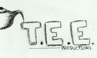
These are a few of my initial ideas for our production company logo, "T.E.E. Productions" .
"T.E.E." being the initials of our names, T-Tasnim, E-Edith. E-Ernie. As a group we decided that we would play with the word "TEE" and apply the concept of teas, as our production sounds like tea, we decided that this also would attract our target audience as it has an element of humour, as well has having an original stamp into the logo.
My sketches are not in colour, as we still have not decided as a group, the colour scehemes we would like to use throughout this project.
These designs are just ideas that will be improved. by using Photoshop, using real images, as well as improving and choosing the relevant fonts, instantly creating a more prefessional finish.
 |
| Idea 1 |
This was my instant idea when we decided that we were going to use the concept of teas.
I think this idea is really simple, but effective. However it lacks originality aswell as potential, as i think it would be difficult to be improved, as it would need a lot of work in order for it to work and to have a professional finish.
On the other hand the composition of the "T.E.E. Productions" is very effective, as its clear, highlights the main focus of the logo which is "T.E.E", therefore it has very high chance of influencing the final outcome of the production logo.
|
| Idea 2 |
The composition of this idea was very much influenced by the first idea.
I decided to add a person with a cup of tea, a teenager, as i thought this could help our target audeince relate to the logo and be more attracted.
A way of improving this could be having various types of people holding the cup og tea, simillary to the "Dreamworks", as they had one with a daytime atmosphere and a nightime.
|
| Idea 3 |
This idea came to me instantly after the first idea.
It simplicity is defienitly its selling point. Its clear, To the point aprroach in my opinion really works.
And improving it would be quite easy as it is up to the standards already.
However i fear that this idea is not targetting our target audience, As i think this idea is more for the older viewing public.
|
| Idea 4 |
This is my improvement for the 3rd idea. As i thought the idea itself works, i decided to simple enlarge the writing, going out the actual cup.
I got the inspiration from the Universals logo. If i was to develop this idea further i would create a homely atmosphere, with warm colours, this i think would be targetting our target market, as well as having a very calm finish, which would act as an warning for the audience to sit down and be comfortable and watch.
|
| Idea 5 |
The other ideas ive come up with are very much concentrated on cups of tea, therefore i have decided to mix this with media related objects.
The idea of making the filming camera having a handle connetating a cup of tea then came to my mind, i was then quick to quickly draw this idea. i then developed the shape of the camera, giving it an "old school", "Retro" feel. I mixed this with the composition of the writing in my first idea.
Combined together i think that this logo is very eye catching, original, humorous, and most of all i think that it attracts our target market.
Subscribe to:
Posts (Atom)